
Colors are produced by light, and light can be expressed as colors in pictures as well. What science has discovered about the power of color was probably studied in detail by the great painters. Along with the advancement of computer science, methods of mathematical engineering are being developed to analyze paintings. Even for those who dislike the idea of viewing art through the eyes of a scientist, they will surely be amazed at the hidden power within certain famous paintings that can now be revealed.
Pioneering color theory by scientists and a great writer
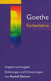
Figure 1: Goethe's “Farbenlehre” (Theory of Colors)
©Verlag Freies Geistesleben, Stuttgart 2003

Figure 2: A color wheel. Adjacent colors are equally spaced in terms of color difference, and opposite colors are complementary.
There once was a writer known as “the man of the eye” who attempted to gain insight into literature through painting and sculpture. However, he eventually realized that he had no talent for such work, and thereafter he focused on pursuing the beauty of formative art through simply “looking.”
The name of the writer is Goethe. He is well known for his dramatic work “Faust,” but he was also a poet, philosopher, and scientist. Indeed, he considered his most essential work not to be “Faust,” but “Farbenlehre” (Theory of Colors) published in 1810 (Figure 1).
Isaac Newton was the first scientist to undertake a modern scientific study of color and light. In 1666, he used a prism to comprehend the relationship between white light and separated spectral colors. Before Newton, it was thought that prisms add colors to white light, but Newton proved this to be wrong by using another prism to mix the split spectral colors back into white light.
However, Goethe disagreed with Newton's theory of light. Unlike the theory of physical light propounded by Newton, Goethe put forward the psychological effects of colors in his “Theory of Colors,” a work upon which modern color psychology is based.
One of the results of Goethe's research was the “psychological complementary color” effect.
Complementary colors are divided into two categories: (1) physical complementary colors and (2) psychological complementary colors. The difference between the two is attributable to their definitions, and actually there is little difference between them. Physical complementary colors are colors of light that will produce white light when mixed together.
On the other hand, psychological complementary colors are psychological colors that appear in one's vision due to the effects of an afterimage. Psychological complementary colors are directly opposite each other on the color wheel (Figure 2). For example, look at the red heart in Figure 3 (left) for 30 seconds. Next, look at the black dot on the right, and you will see a blue-green heart. At this point, blue-green is the psychological complementary color of red. Goethe noticed that there existed additive complementary colors and he wrote in his paper that these were the most harmonious colors.

Figure 3: Staring at the red heart for 30 seconds reveals a blue-green heart (red's complementary color) when the eye is shifted to the black dot.
Artists avidly studied these theories of colors, and used them extensively in their work (Figure 4).
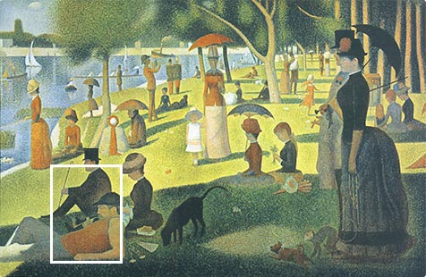
Figure 4:
“A Sunday Afternoon on the Island of La Grande Jatte,” one of the most famous works of Georges Seurat, a master of stipple drawing. Seurat was an artist who studied Goethe's and Chevreul's theories of colors and utilized them in his own innovative work.
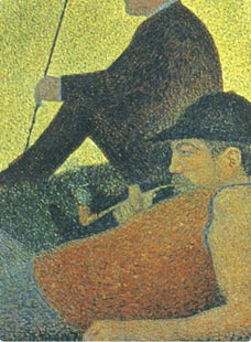
Purple dots on the grass, a complementary color of yellow-green representing the sunlight, and blue-green dots on the shirt, a complementary color of red, can be observed.
©akg-images / PPS
Viewing masterpieces through the eyes of science

Figure 5:
Top: The CIELUV color space, a space to represent colors in a 3D color space
Bottom: In the CIELUV color space, the difference in colors perceived by humans is represented by the distance between two colors.
A color space determined by the CIE (Commission Internationale de l'Eclairage). In this color space, distance is proportional to color difference as perceived by humans. Thus it is often used for measuring color differences.
The essence of an artist's experiences is condensed in his or her paintings, represented by colors, composition, and strokes of a paint brush.
“It must be possible to objectively analyze the beauty of a painting by converting it into quantitative data,” so says Mitsuo Kobayashi, professor of mathematical engineering at the University of Electro-Communications. Mathematical engineering is the study of the actual world through models that are mathematically or theoretically analyzed along with data obtained from the actual subject. Professor Kobayashi has analyzed many paintings using mathematical engineering tools and developed methods for mathematically expressing the characteristics of paintings, namely, colors, compositions, and brushstrokes.
In his analytical studies, Professor Kobayashi uses a 3D color space for quantifying colors (Figure 5). For example, in this method, sampling colors extracted from each painting are represented in a 3D color space. Many paintings can be grouped by artists according to similarity of sample color distribution in the color space. In other words, this scientific method reveals objectively that there is a definite inclination in colors artists favor in their paintings (Figure 6).
Professor Kobayashi has also invented a method for quantifying color difference, which plays a crucial role in paintings. First, he overlays a grid on the painting to divide it into cells, and determines colors for each cell. What is crucial here is not using the average value for all colors that may lie within the cell, as an average of multiple colors will differ from the colors actually used and will not reveal true color difference. Instead, Professor Kobayashi takes note of the “dominant color,” a color occupying the largest area in the cell (Figure 7). This is a very effective method in the first step to analyzing colors in paintings.
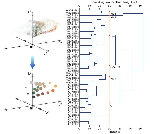
Figure 6:
Left: Many colors extracted from certain painting are represented in a color space (Top). Furthermore, these colors are represented by 20 typical colors (Bottom). The size of the color balls corresponds to the surface area of each color used in the painting.
Right: A number of paintings from certain artists are analyzed. Color space distribution for 20 typical colors is created for each painting. (Ma01:dist to Ma08:dist shows color space distribution for Franz Marc's eight paintings. Ut01:dist to UT22:dist are for Maurice Utrillo's paintings, and C01:dist to C19:dist are for Caravaggio's paintings.) The horizontal axis on the illustration above shows the distance defined by calculating the difference in color space distribution for each painting using a quantified difference in the proportion of color difference to the color picture area. The illustration above shows a schematic diagram grouped according to the shorter distance. If a vertical line is drawn at a large distance point, similar paintings can roughly be grouped and, at a small distance point, much finely grouped.
Let's take a look at the line at distance 30, it shows that most paintings are approximately grouped together by the same painter.
©Prof. Mitsuo Kobayashi, University of Electro-Communications
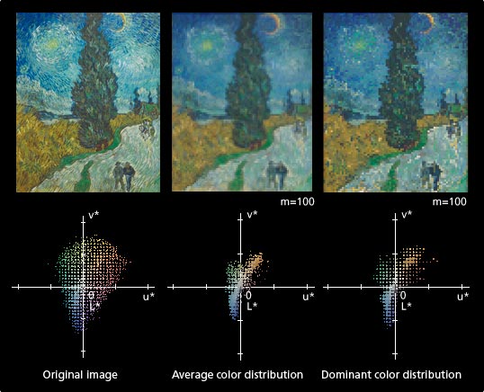
Figure 7: Van Gogh “Road with Cypress and Star”
Left: Original image and the color distributions of sample colors in a color space.
Center: Rendered image with average colors and the color distribution in a color space when the image is divided into 100 x 100 cells.
Right: Rendered image with dominant colors and the color distribution in a color space when the image is divided into 100 x 100 cells.
The average color distribution shows no trace of color differences, while the dominant color distribution shows a trace of relatively distinct color difference. The color difference can be confirmed by checking if there is a clear contour of the motive of the picture or if the color distribution in a color space is close to the original image's color distribution. We know that color preservation works best with dominant colors, rather than with average colors.
©Prof. Mitsuo Kobayashi, University of Electro-Communications
©akg-images / PPS
Artists who brought light to the darkness
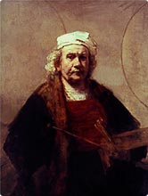
Figure 8: One of Rembrandt's best known late self-portraits. Rembrandt painted many self-portraits throughout his life. In this one, the effects of light are softer compared to his earlier years. He developed the chiaroscuro technique, in which light is spotlighted on the attention of the viewer.
©Granger Collection / PPS
A single streak of light piercing the darkness, or a candle illuminating a human face: In the 16th and 17th centuries there was a group of artists who were said to have recreated the areas of light and dark: Caravaggio, who realistically painted the dramatic effects of light, La Tour, who drew light in the darkness to explore religious themes, and Rembrandt, who painted serene light in deep darkness.
Goethe greatly admired Rembrandt, who died about 80 years before Goethe was born. In 1831, he wrote “Rembrandt A Thinker.” Apparently Goethe enjoyed Rembrandt's paintings by imagining them as plays in which each depicted character played a part.
Rembrandt used light to draw attention to specific parts of the painting while leaving the rest cloaked in darkness. Rembrandt obviously differs from Caravaggio and La Tour in terms of his treatment of light and dark, but how exactly ?
Adjacent colors are very important when dealing with the effects of chiaroscuro. There is a large difference in color, for example, between the illuminated parts of a face and those which lie in darkness.
To measure the effects of color difference, Professor Kobayashi divided a painting into 100x100 cells and extracted the dominant color for each cell. The dominant colors in adjacent cells are compared, and then the largest value is saved (Figure 9). Finally, which color attribute—lightness, chroma, or hue—is most responsible for color difference is studied.
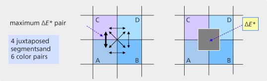
Figure 9: After a grid is overlaid, there are different combinations of six adjacent square pairs. The pair with the greatest color difference is saved.
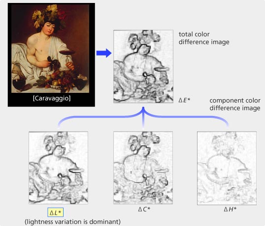
Figure 10: “Bacchus” by Caravaggio. Color difference is denoted by depth of black lines. Overall color difference (ΔE*) reveals color difference to be greatest along object contours. Upon further research into which one of three aspects of color—lightness difference (ΔL*), chroma difference (ΔC*) representing vividness, or hue difference (ΔH*) representing differences in color—most contributes to overall color difference, it was found that lightness difference contributes the most.
©Prof. Mitsuo Kobayashi, University of Electro-Communications
©akg-images / PPS
This result illuminates the difference in methods among these three artists.
Caravaggio, the master of chiaroscuro, used greater difference in lightness (ΔL*) between adjacent squares of the canvas to depict dramatic lightness and darkness (Figure 10), while Rembrandt utilized both small and large differences in brightness and rich differences in chroma (ΔC*). Finally, La Tour has a relatively stable difference in brightness and darkness between squares, which means that his canvasses exhibit stable changes in light across space. This makes sense for an artist known for the soft radiating glow of candles.
A series of mathematical analysis reveals abundant information about these masterpieces and the techniques by which they were created. This knowledge may be useful for further study of effective use of color.
However, Professor Kobayashi wants to understand “what people find beautiful.” Up until now we have approached paintings only subjectively, but a mathematical approach can also yield objective insights into beauty as well.
This type of research, combining the diverse fields of computer science, color theory, and mathematical engineering, is very rare. This new field of research has benefited from the serendipity of Professor Kobayashi's specialty of mathematical engineering, his background as an appreciator of art from a young age, and his contact with color theorists from around the world. Other attempts to integrate scientific methods into art have also been made, but this new venture into viewing the beauty of paintings through the eyes of science may be the first of its kind.
Prior to the 18th century, science and art were both known as “ars.” This Latin word for culture in the broadest sense suggests that science and art do not need to be considered opposites at all. It is for this reason that using cutting-edge computer science to shed new light on art and beauty is perhaps a return to the true origin of both disciplines.
Editorial contributor
Professor Mitsuo Kobayashi of the University of Electro-Communications for his cooperation with this article